Use the Site Trends page to view sales and transaction data for the company or site, and see how those values compare to the past.
See Site Trends KPI definitions for information on how to define Key Performance Indicators (KPIs).
You can also view Site Trends from the Global Commerce Home page (Dashboard). The Site Trends: Demand Sales pod on the Dashboard shows a site trends summary and shows just demand sales, with the option to change the comparison metric.
Site Trends attributes
| Attribute | Description |
|---|---|
| Filter |
Use the following attributes to filter the Site Trend results.
|
| Comparison Metric |
Choose one of the following comparison metrics:
|
| Key Performance Indicator |
This column shows the Site Trends KPIs. Click a sparkline graph to see a detailed representation of the graph. Requirement: To see the detailed graph, the latest version of Flash must be installed and enabled in your browser. See Site Trends KPI definitions for a description of the KPIs. |
| Trend | This column shows the trend for the past 7 days. See Sparklines for more information. |
| Actual | This column shows the current results for today. |
| Same Day Last Year |
This column shows the results for the same day last year. This column appears when you select Same Day Last Year as the Comparison Metric. |
| Actual vs Same Day last Year |
This column shows the overall trend when comparing the actual performance versus the performance on the same day last year. See Trending arrows for more information. This column appears when you select Same Day Last Year as the Comparison Metric. |
| Previous Day |
This column shows the results for the previous day. This column appears when you select Previous Day as the Comparison Metric. |
| Actual vs Previous Day |
This column shows the overall trend when comparing the actual performance versus the previous day's performance. See Trending arrows for more information. This column appears when you select Previous Day as the Comparison Metric. |
You can choose which currency you want to appear in the reported data when viewing Site Trends on the Home page or under the Reports section. By default, dashboards report data in USD. When you select a different currency, the dashboard shows values according to the selected currency.
The list of currencies you can select to view is the same, regardless of the locales or currencies your sites are set up to support. The currencies you can use to view data in Site Trends are as follows:
- USD (United States, Dollar)
- AUD (Australia, Dollar)
- CAD (Canada, Dollar)
- EUR (Europe, Euro)
- GBP (Great Britain, Pound)
- JPY (Japan, Yen)
- SEK (Sweden, Kronor)
When viewing the Site Trends dashboard you can choose the time frame, you want to use for the data. When the dashboard includes comparison data, the time shows the comparisons over time.
The following list outlines how the system calculates and defines the time frame periods. Note that some of these time frames are not available on all dashboards.
- Daily—The last complete day. This may or may not be yesterday, due to when the system updated the data in the database and time zone differences. In most cases, however, daily will show yesterday's data. You can always tell which day's data is being shown by the data that appears next to the pod titles.
-
Weekly—The last complete week. A week runs from Monday through Sunday.
Example: When you view data on Thursday, March 29, 2018, the data reflects the previous full week (Monday, March 26, to Sunday, April 1).
- Monthly—The last complete month. This means when you view data on Thursday, March 29, 2010, the data reflects the previous full month (March 1, 2018 to March 31, 2018).
- Quarterly—The last complete quarter. This means that if you were viewing data on Thursday, March 29, the data would reflect the previous full quarter (Q3, which is January 1 to March 31). The following list shows the dates for the four quarters in a year:
- Quarter 1 (or Q1)—January 1 to March 31.
- Quarter 2 (or Q2)—April 1 to June 30.
- Quarter 3 (or Q3)—July 1 to September 30.
- Quarter 4 (or Q4)—October 1 to December 31.
A sparkline is a small graphic designed to give a quick representation of a trend in the form of a graph without axes or coordinates. The Trend field in Site Trends shows a sparkline. This sparkline shows how a specific KPI performed over a specific period. The following image showS an example of a sparkline.

The sparkline uses the same time frame selected for the dashboard or Site Trends. The sparkline shows the trend for the KPI for the last 7 time intervals select for your time frame. See Time Frame for more information.
Example: When you review monthly data, the sparkline shows the data for the last 7 months.
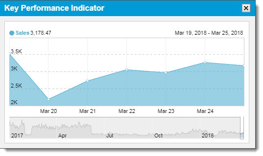
To see a detailed representation of the graph, click the sparkline. The following image shows an example of a detailed graph.

When viewing the detailed graph, note the following:
- The name of the KPI associated with this graph, as well as the value for that KPI appears in the upper-left corner of the window. When you hover your cursor over a data point (the circles on the graph) that value changes to show how the KPI performed on the day or time for that data point.
- Click the graph and drag left or right to move backward or forward in time.
- Use the slide bars at the bottom of the graph to adjust the time frame shown in the graph. Changing the time frame here changes the default time frame in the detailed graph.
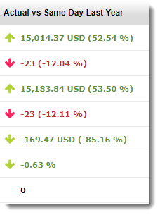
Site Trends use trending arrows to show how the current performance compares to previous performance during the same time frame. The image shows a trending arrows example.

Trending arrows provide a visual cue on whether a trend is a positive or negative change, depending on the increase or decrease over time. Because an increase or decrease can be positive or negative depending on the specific KPI, the direction of the arrow puts the increase or decrease in perspective.
Example: If the value of returns decreased over time that is a positive change, so the arrow would be facing down (because of the decrease) and green to indicate that a decrease is positive.
The following list describes the trending arrow by color:
-
Red arrows indicate that the change over time is a negative trend.
Example: A red arrow appears if your revenue per visit decreased from the previous time frame.
-
Green arrows indicate that the change over time is a positive trend.
Example: A green arrow appears if your sales increased from the previous time frame.
-
Gray arrows indicate the change over time is neither a positive or negative trend.
Example: The number of marketing emails you sent increased or decreased from the previous time frame represents a neutral trend. Since the number of emails you send does not necessarily increase your revenue or have a positive or negative effect in your store the system considers it is neutral regardless of the trend.
Trending arrows point up or down, depending on whether the trend from the previous time frame increased or decreased:
- If an arrow points, the value of the KPI increased over time.
- If an arrow points down, the value of the KPI decreased over time.
This topic describes how Global Commerce calculates the KPIs for Site Trends.
Demand sales
Demand Sales occur when the shopper submits an order for a product, but the shopper has not downloaded the product, or the fullfiller has not shipped the product. Includes orders where the shopper used the delayed payment method. It does not include returns, cancellations, suppressions, or fulfilled items.
Fulfilled sales
Fulfilled sales occur when the shopper downloads or the fullfiller ships the order the shopper submitted.
| Fulfilled Sales | |
|---|---|
| KPI | Definition and Calculation |
| Gross Sales |
Definition: Total sales, after discounts. Does not include tax or shipping. |
| Gross Orders |
Definition: Number of orders. |
| Net Sales |
Definition: Total sales after returns are considered. Calculation: Gross Sales - Returns |
| Net Orders |
Definition: Number of orders after returns are considered. Calculation: Gross Orders - Returns |
| Return Sales |
Definition: Total returns. Does not include tax and shipping. |
| Return as a % of Gross |
Definition: Percentage of gross sales that were returned. Calculation: Return Sales / Gross Sales |
| Return Orders |
Definition: Number of orders returned. |
| Average Order Value |
Definition: Total average value for all orders. Calculation: Gross Sales / Orders |
| Average Selling Price |
Definition: Total average price for all products sold. Calculation: Gross Sales / Gross Units |
Required Role: Reporting Manager![]() This Global Commerce user role allows users to generate and view online reports for all sites owned by the company or a specific site owned by the company. or Site Pulse
This Global Commerce user role allows users to generate and view online reports for all sites owned by the company or a specific site owned by the company. or Site Pulse![]() This Global Commerce user role allows users to view site trends for any site where you enabled this role.
This Global Commerce user role allows users to view site trends for any site where you enabled this role.
- Select Reports and click Site Trends. The Site Trends page appears.
-
Select a site, time frame, and currency value from the Settings pod and then Click Apply settings.
Note: If you only have one Company or Site, these fields should be populated with the correct information by default.